
Multidisciplinary creative specialising in design, illustration, branding, and art direction.
Design
Illustration
Experiments
About
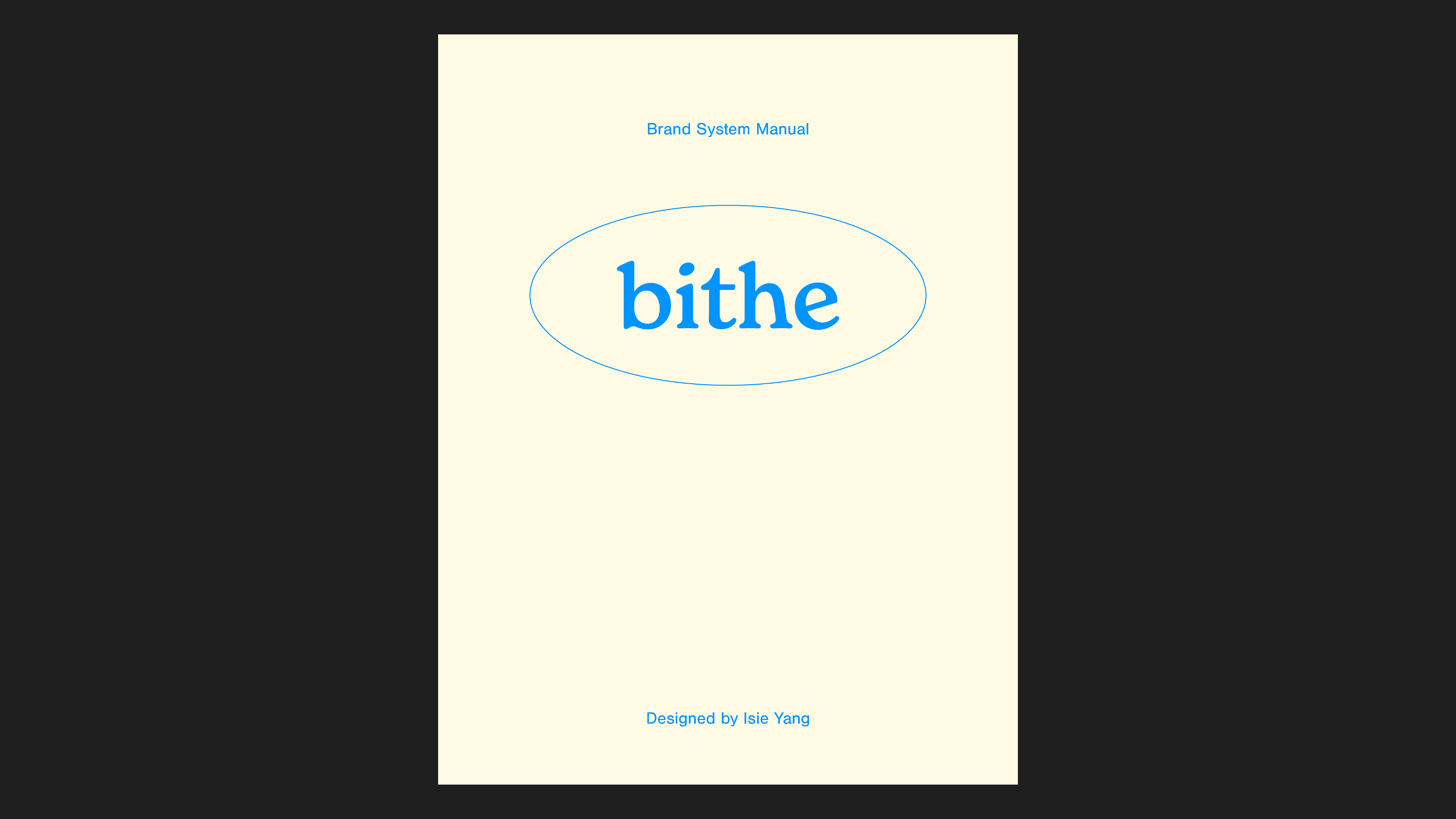
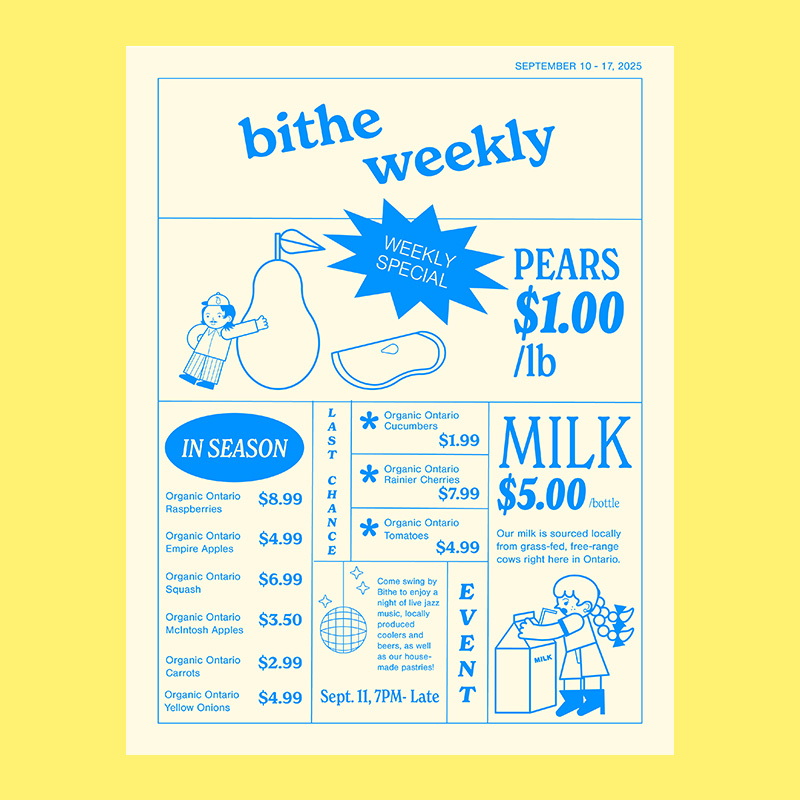
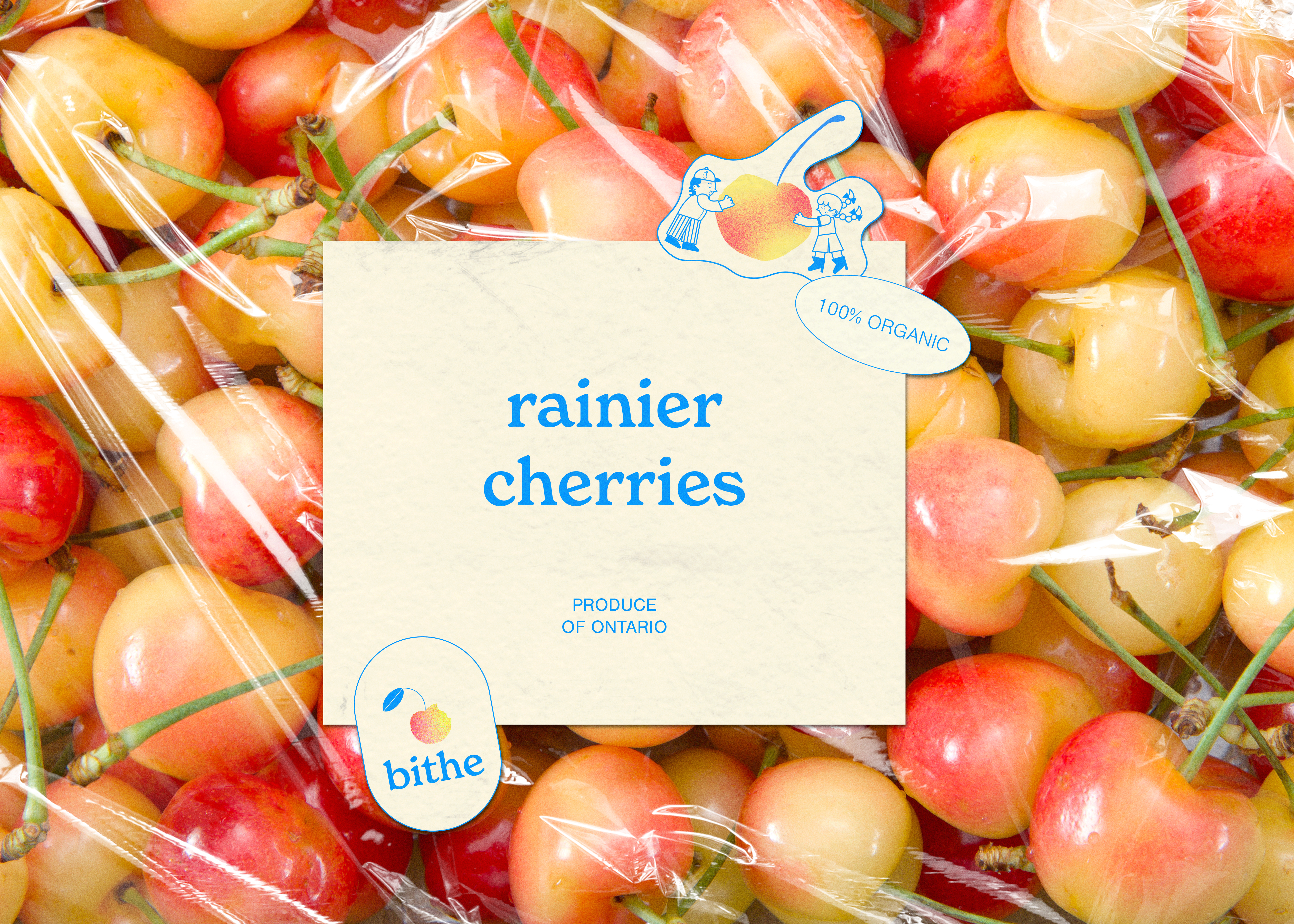
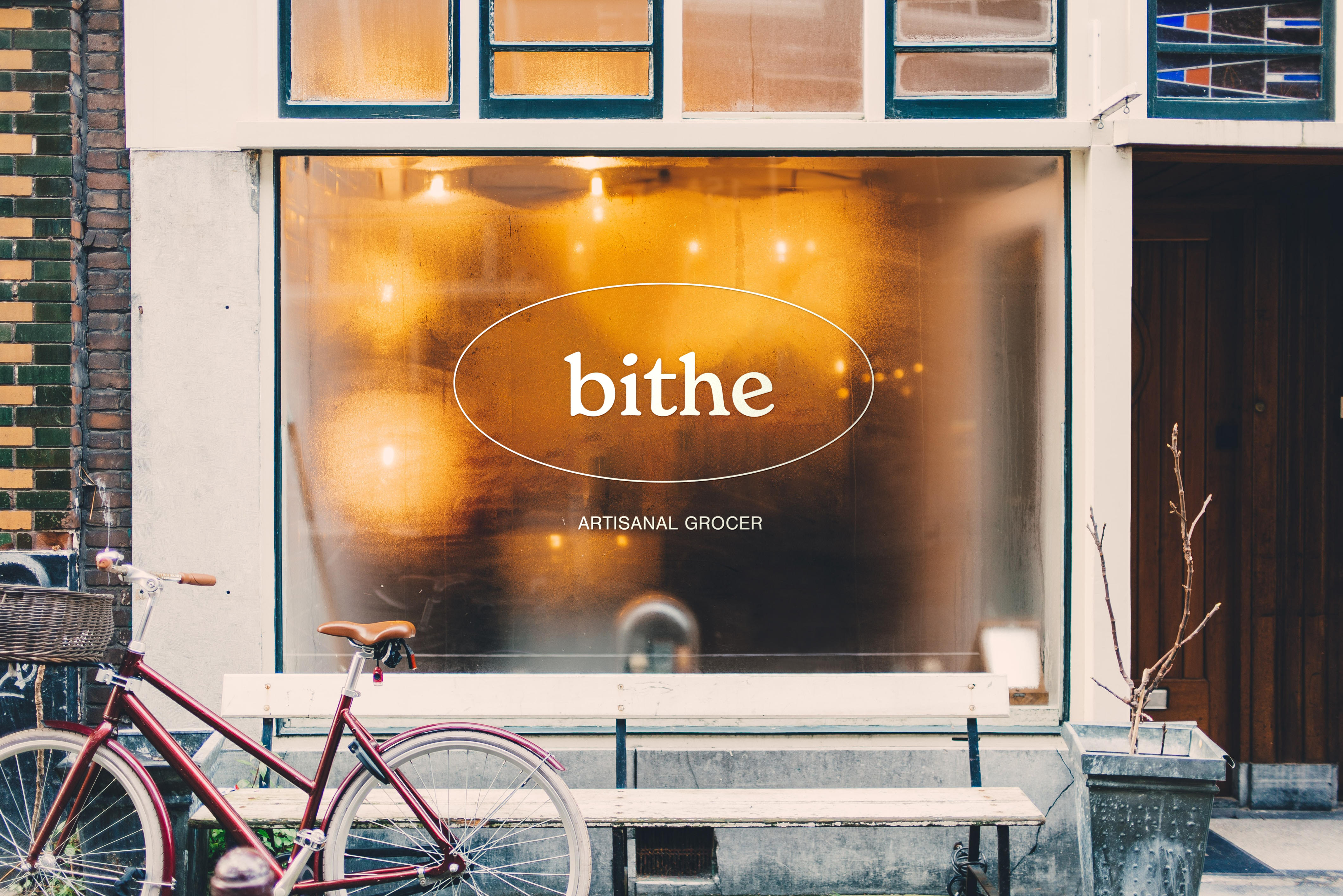
Bithe
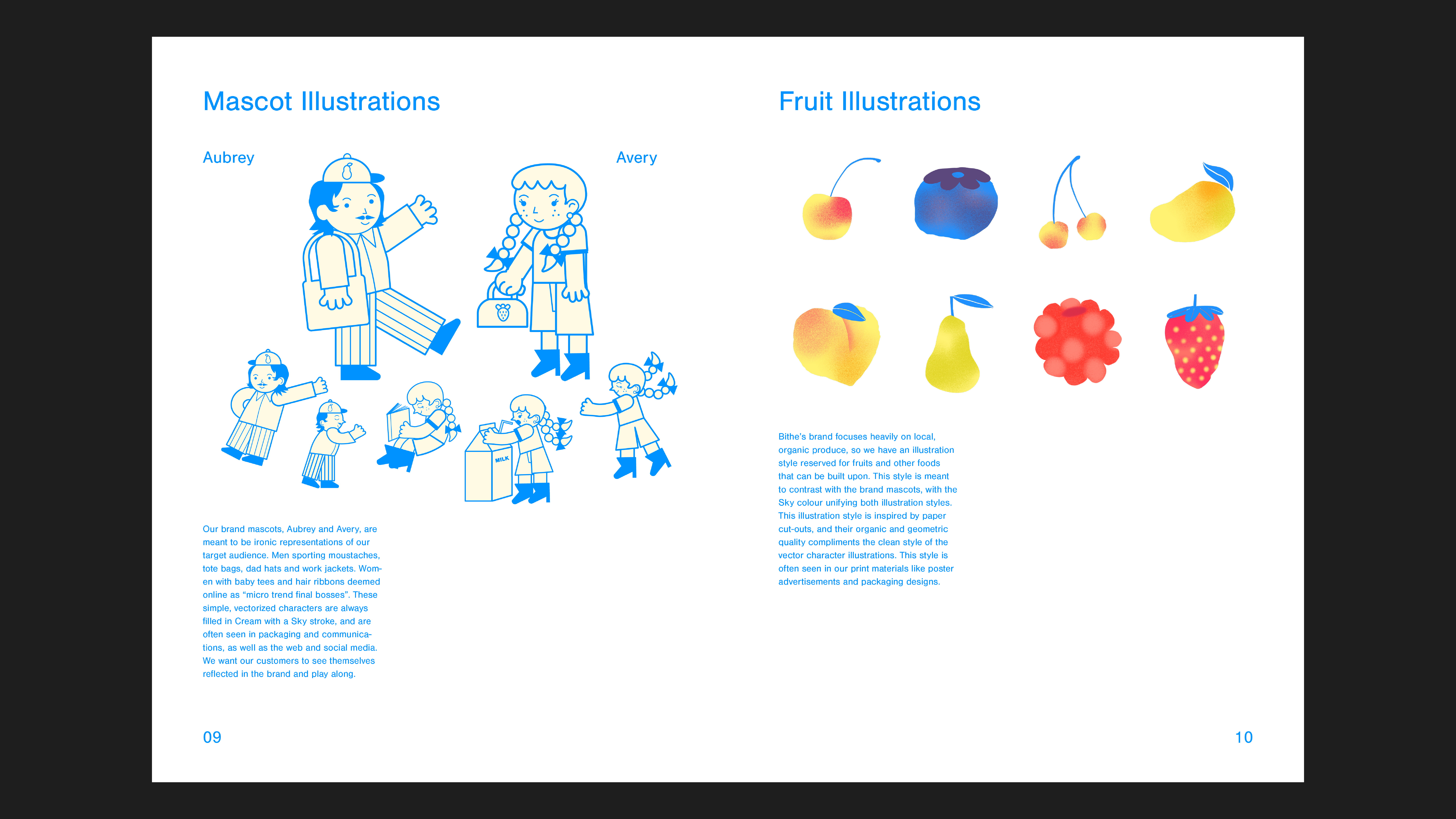
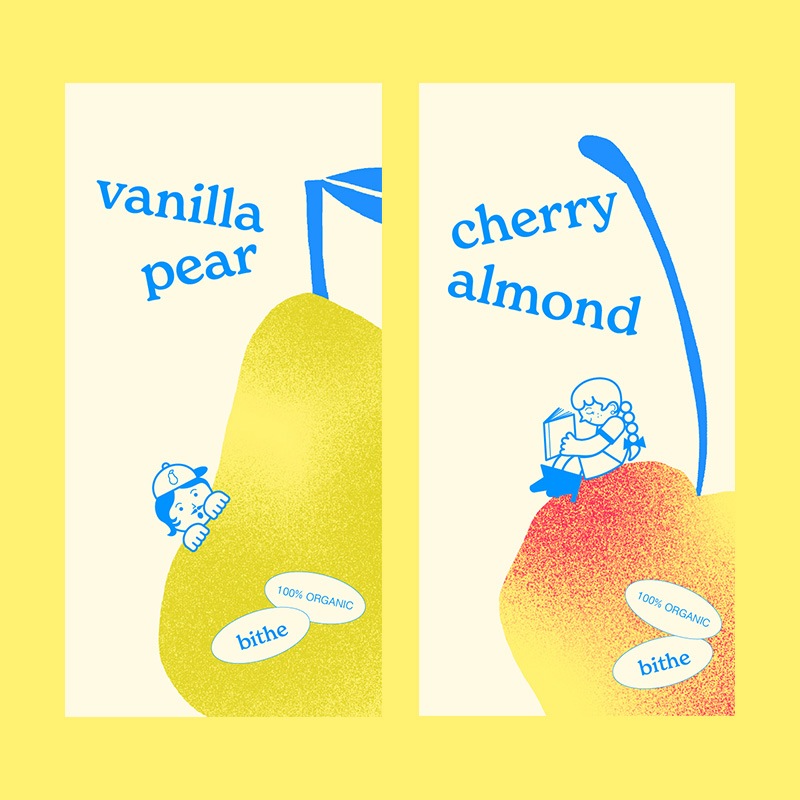
A thesis branding project for a concept high-end artisanal grocery store. The branding is targeted towards young urban professionals, and includes playful tongue-and-cheek illustrations and vintage-meets-modern typefaces.
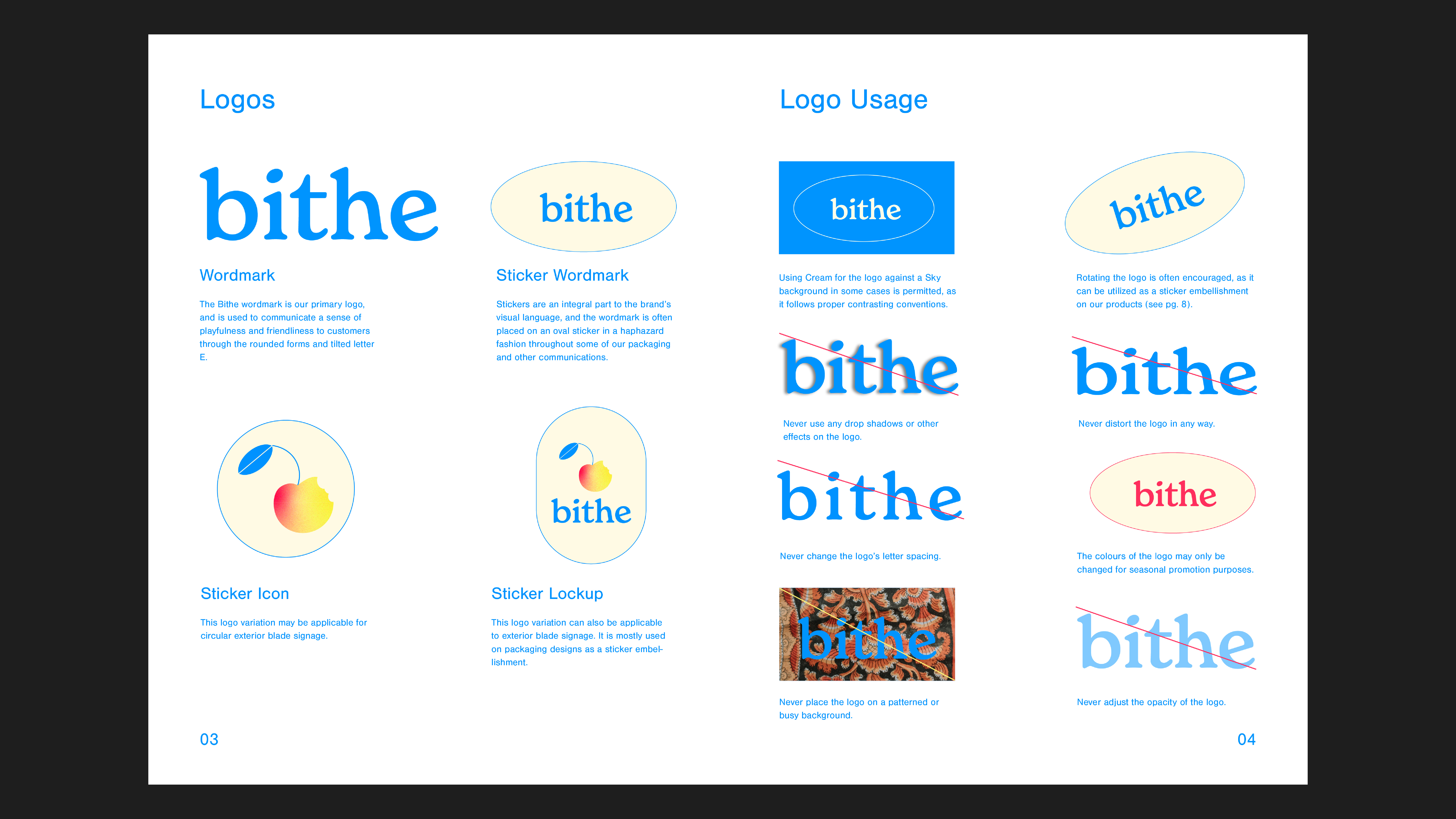
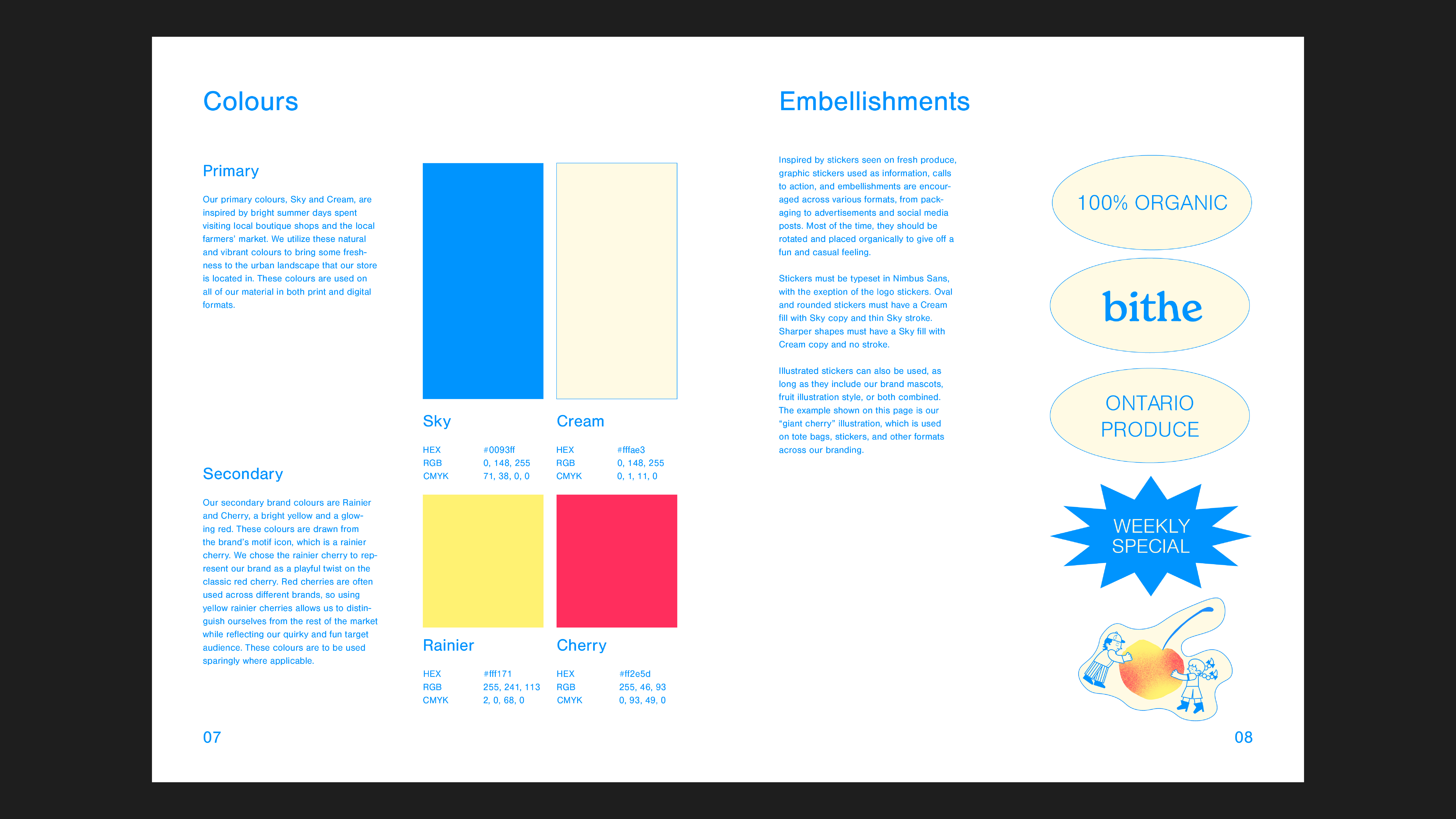
Stickers are peppered across the brand system that are inspired by produce stickers found on fruits and vegetables.
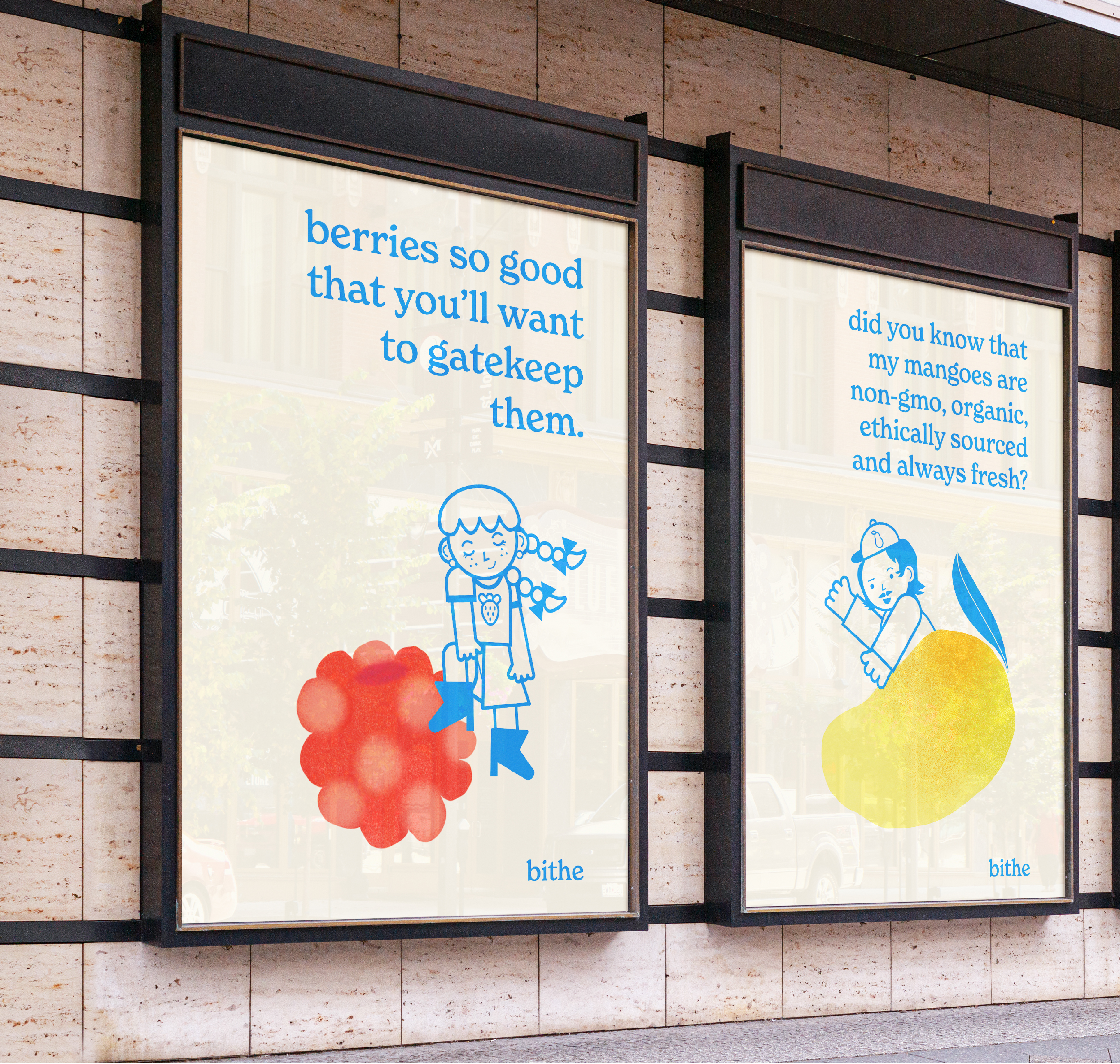


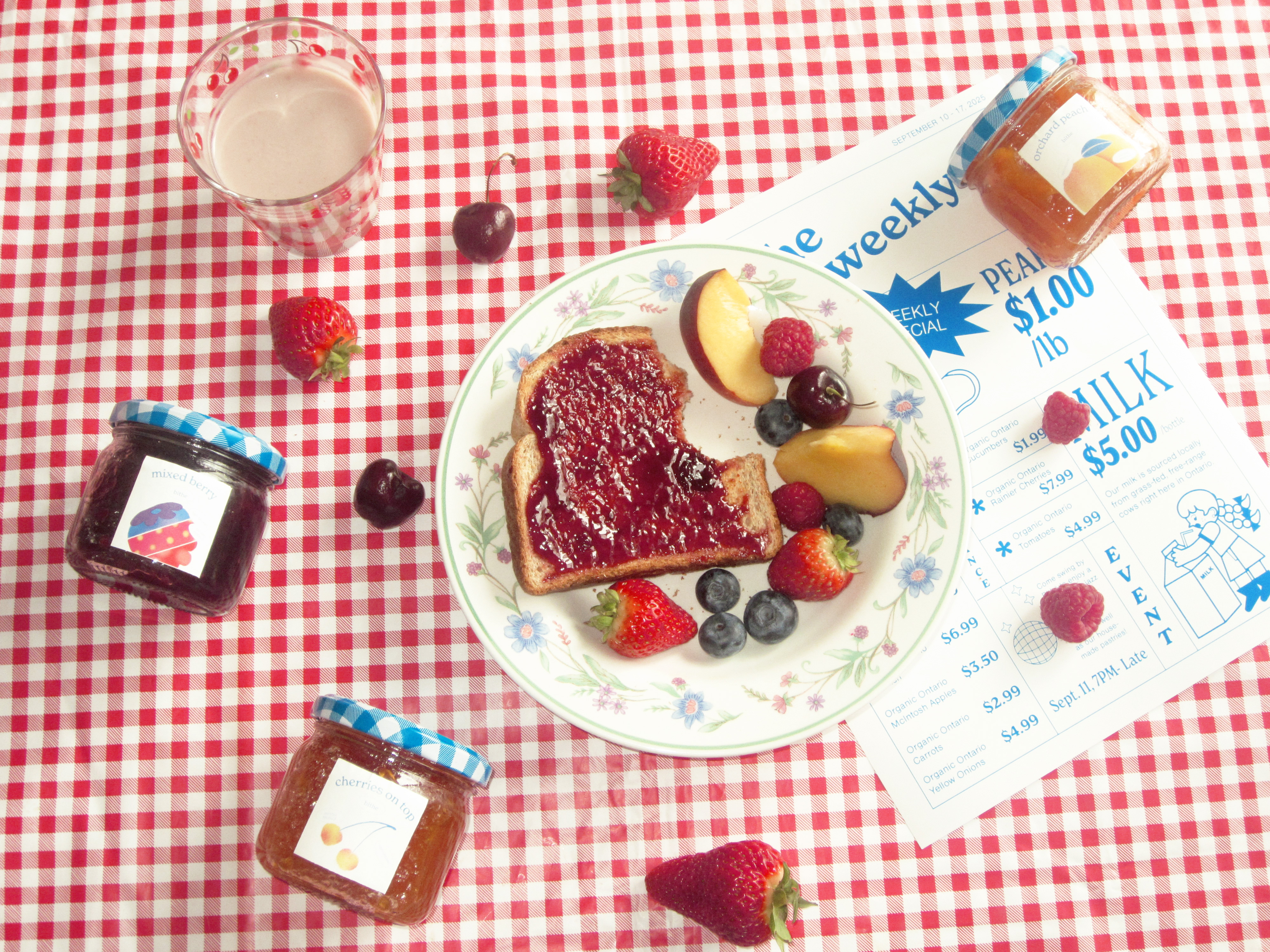


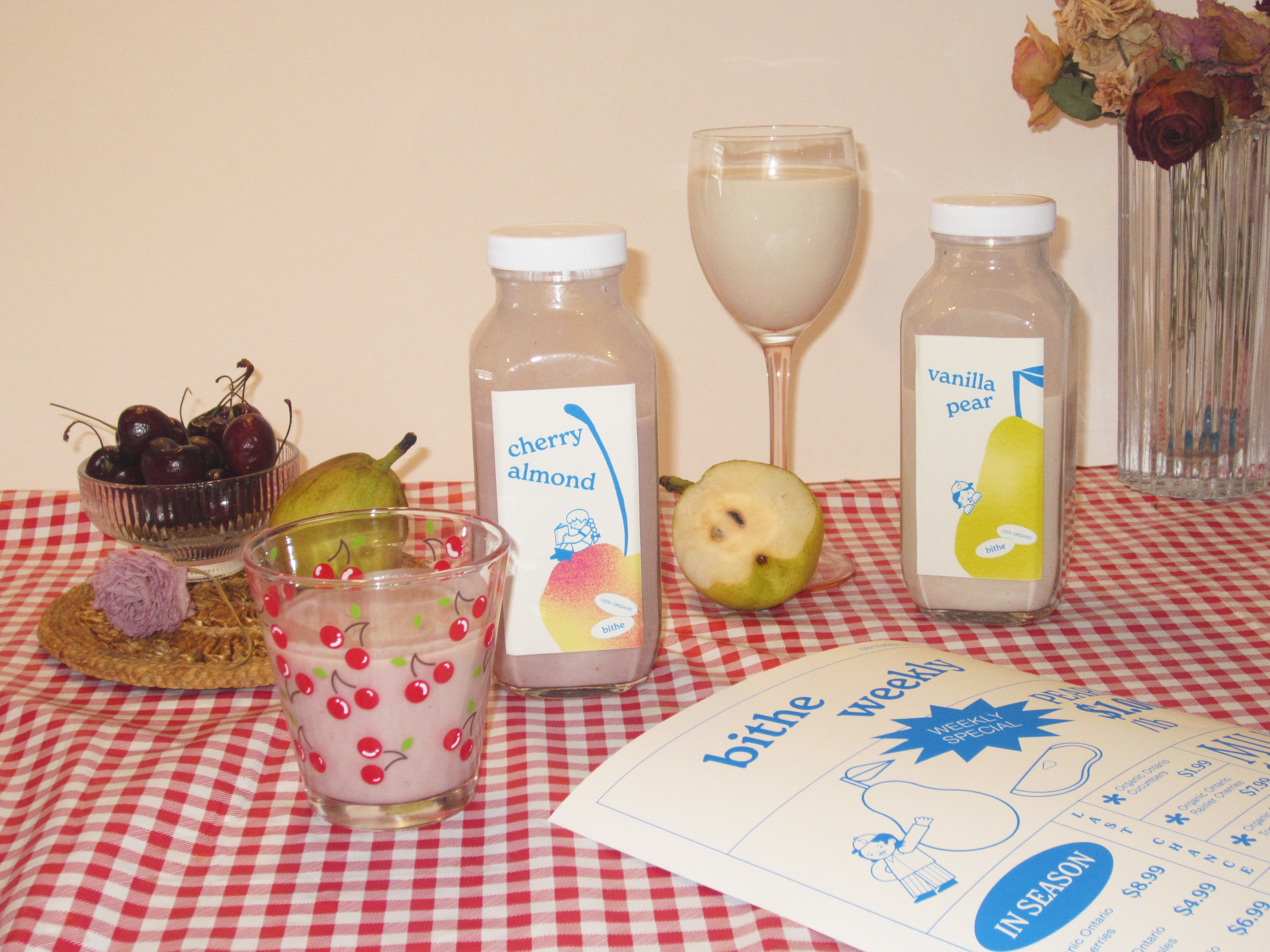

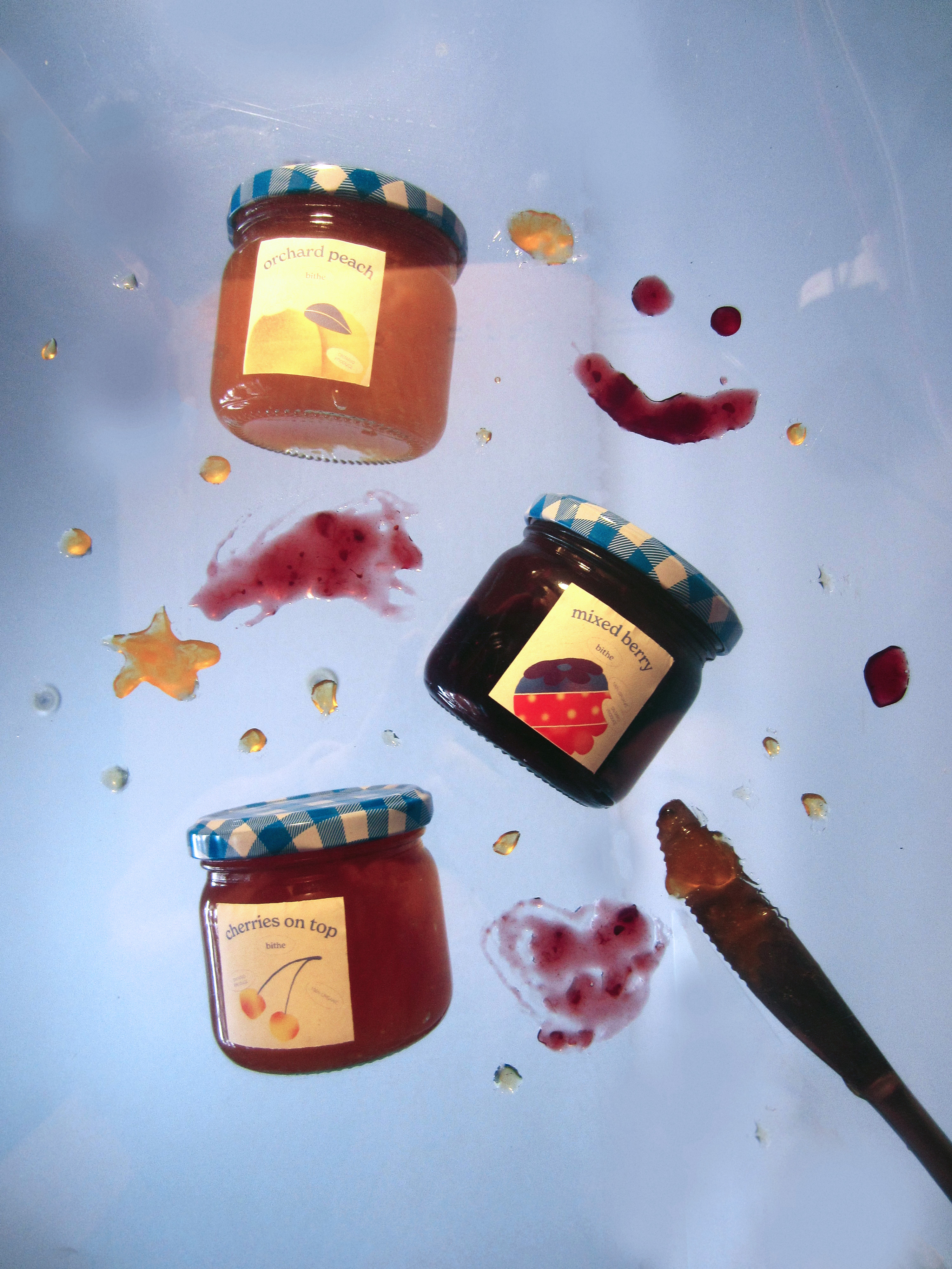
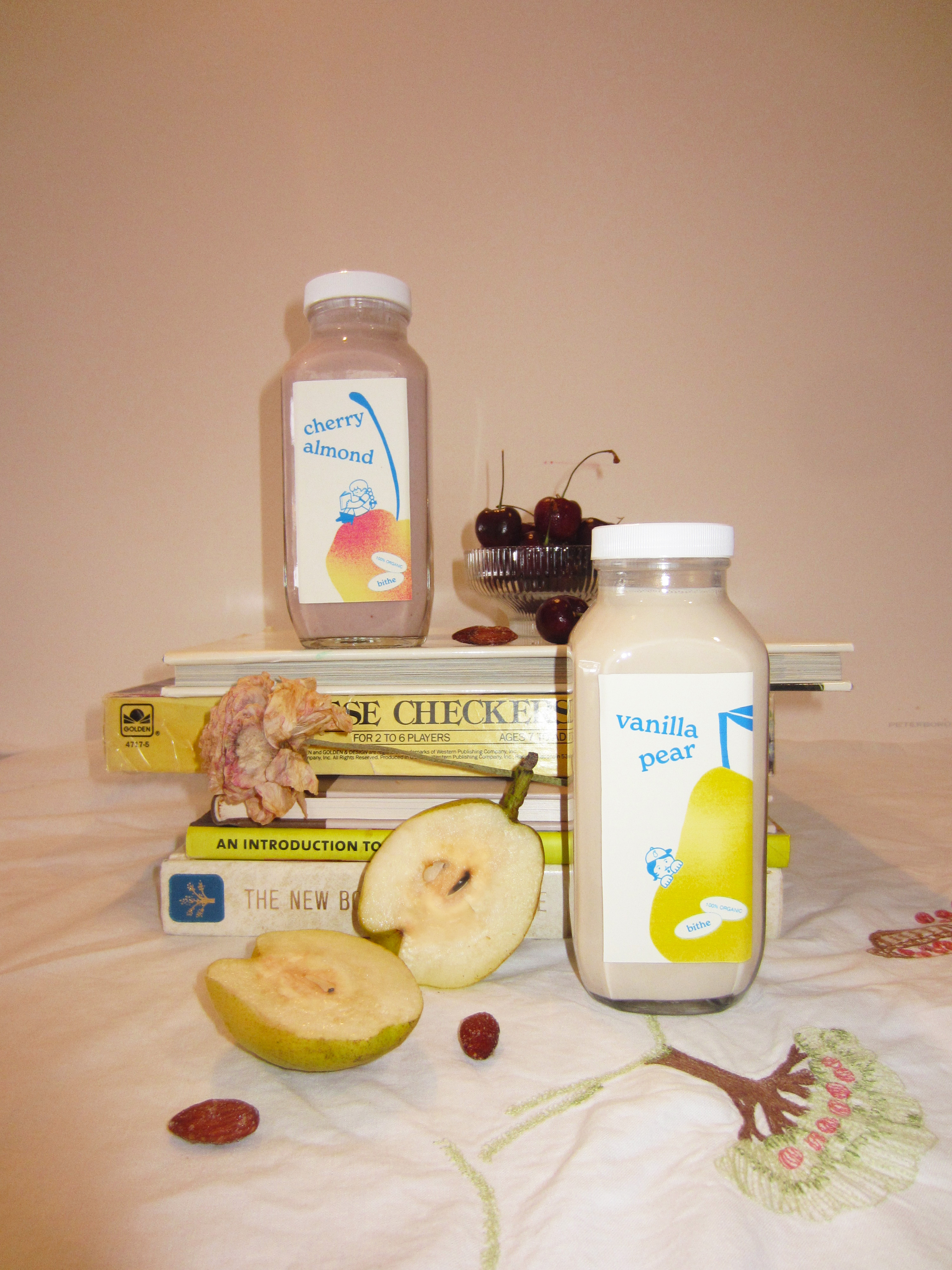


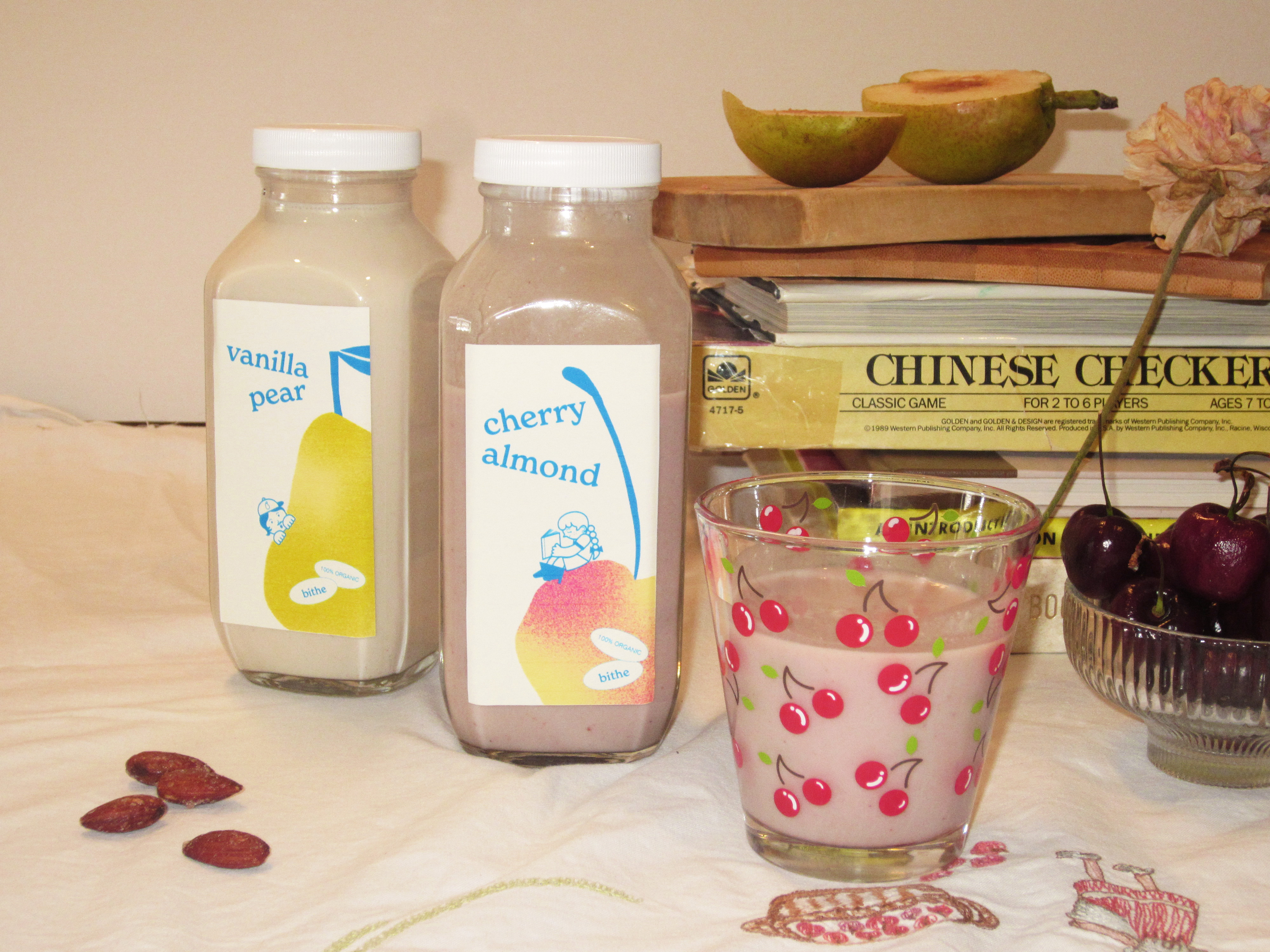
Art direction and by me, inspired by casual and fun flash photography.
Photographs shot by me on a Canon PowerShot digital camera.
Special thanks to my parents and brother for assisting me with this shoot!